
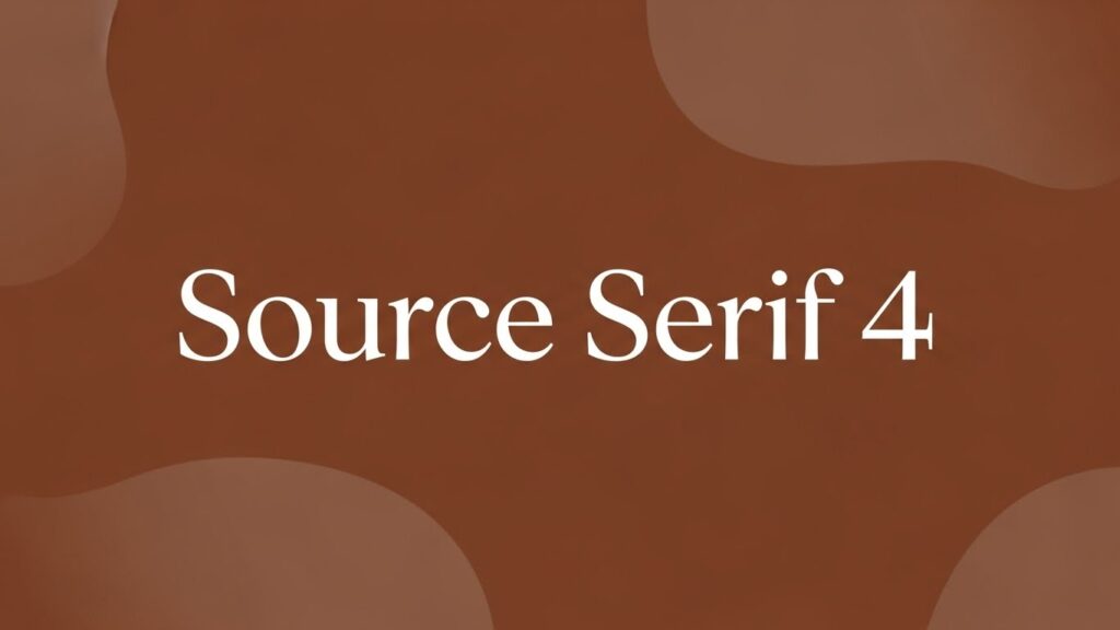
Introduction to Source Serif 4
In the world of typography, certain fonts stand out for their clarity, readability, and elegance. One such font is Source Serif 4, which has become a favorite for designers and publishers alike. Whether you’re creating a digital publication, a website, or print materials, choosing the right font can significantly impact your design. In this article, we explore Source Serif 4, its key features, and why it’s an excellent choice for various design projects.
What is Source Serif 4?
Source Serif 4 is an open-source serif font designed by Frank R. J. Müller as part of the Source family. It is a contemporary take on the classic serif style, designed to offer high legibility while maintaining aesthetic appeal. Source Serif 4 is a versatile font, suitable for both digital and print applications, making it a popular choice for a variety of design needs. It is available for free through Google Fonts, making it accessible to designers everywhere.
The font comes in several weights, allowing users to choose the perfect variation for their project, whether it’s for headlines, body text, or captions.
The Origins of Source Serif 4
The Source Serif family was created by Adobe, a company known for its contributions to digital design and typography. Adobe’s intention behind Source Serif 4 was to create a modern serif font that was highly readable, accessible, and versatile for both print and web applications.
The family of Source fonts, including Source Sans Pro, Source Serif Pro, and others, reflects a commitment to open-source design. Over the years, Source Serif has evolved to incorporate more refined features that cater to the needs of modern digital content, while still honoring traditional serif design principles.
Key Features of Source Serif 4
What makes Source Serif 4 unique are its carefully thought-out features, which enhance both readability and visual appeal:
-
Readable Letterforms: Source Serif 4’s design prioritizes legibility, with letterforms that are clean and easy to read at various sizes.
-
Refined Serifs: The font includes elegant serifs that give it a traditional, scholarly look, while still maintaining a modern appeal.
-
Multiple Weights and Styles: With various weights (light, regular, bold), Source Serif 4 allows for flexible use in design projects, offering versatility from body text to headlines.
-
Open Source: As part of the open-source initiative, Source Serif 4 is freely available for commercial and personal use.
These features make it a standout option for everything from editorial design to corporate branding.
Why Choose Source Serif 4?
So, why should you choose Source Serif 4 over other serif fonts? Here are several reasons:
-
Flexibility Across Platforms: Whether you’re designing for web, print, or mobile apps, Source Serif 4 adapts perfectly across different platforms.
-
Improved Readability: Thanks to its well-balanced design, Source Serif 4 is highly legible even in small sizes, making it perfect for long-form text.
-
Aesthetic Appeal: Its elegant, classic look brings sophistication to any design project, making it ideal for everything from book layouts to web typography.
-
Free for Commercial Use: Being open-source, Source Serif 4 is free to use for both personal and commercial projects, making it an affordable and effective choice for professional designers.
These factors make it a go-to choice for many typographers and web designers looking for a high-quality serif font.
Source Serif 4 vs. Other Serif Fonts
When compared to other popular serif fonts like Georgia, Times New Roman, or Merriweather, Source Serif 4 stands out for its modern aesthetics and improved legibility. While classic fonts like Times New Roman are traditional and familiar, they can sometimes feel outdated in a modern digital environment.
Here’s how Source Serif 4 compares to others:
-
Source Serif 4 vs. Georgia: While Georgia is highly readable, Source Serif 4’s design feels fresher and more adaptable to contemporary digital design.
-
Source Serif 4 vs. Times New Roman: Times New Roman can seem rigid, whereas Source Serif 4 has more open letterforms, making it more pleasant to read on digital screens.
-
Source Serif 4 vs. Merriweather: Merriweather is another excellent choice for readability, but Source Serif 4 has a slightly more refined, sophisticated appearance.
In short, Source Serif 4 combines tradition with modernity, offering superior legibility and a polished look.
The Design Philosophy Behind Source Serif 4
The design of Source Serif 4 was guided by a philosophy of balance—balancing classic serif traditions with modern needs for readability and versatility. Frank R. J. Müller, the designer, took inspiration from historical fonts while ensuring the letterforms were optimized for digital clarity.
Key principles that guided its creation include:
-
Legibility First: The font prioritizes legibility in both printed materials and on-screen texts, addressing the growing demand for readable fonts in various digital formats.
-
Dynamic Structure: The design incorporates a dynamic contrast between thick and thin strokes, enhancing the visual flow.
-
Clear Hierarchy: It’s easy to differentiate between various text elements (headlines, subheadings, body text) using Source Serif 4, thanks to its consistent x-height and proportional design.
How to Use Source Serif 4
Using Source Serif 4 in your projects is easy, thanks to its flexibility and available options:
-
Web Design: Embed Source Serif 4 into your website using Google Fonts for a clean, readable font for all types of content, including articles, blog posts, and headings.
-
Print Design: Use Source Serif 4 for magazines, books, and brochures, where readability and style are equally important.
-
Branding: The font can also be used in logos, business cards, and other corporate materials to convey a polished, professional image.
No matter the medium, Source Serif 4 offers unparalleled flexibility for various design applications.
Source Serif 4 for Print vs. Digital Media
While Source Serif 4 is highly versatile, it excels in both print and digital media in different ways:
-
Print: With its traditional serif style, it offers excellent readability for books, magazines, and newspapers. The subtle curves of the serifs are designed for clear and crisp print output.
-
Digital Media: Source Serif 4 is also optimized for digital screens, ensuring legibility even in smaller sizes on mobile devices and desktops. The open and airy design prevents the font from appearing too compressed on digital screens.
Its hybrid adaptability makes Source Serif 4 ideal for projects that require cross-platform compatibility.
The Benefits of Using Source Serif 4 for Web Design
Using Source Serif 4 for web design offers several benefits:
-
Responsive Typography: The font adjusts well to different screen sizes, ensuring consistency across devices.
-
SEO-Friendly: Clear, legible fonts improve user experience, which can contribute to better SEO rankings, especially for content-heavy websites.
-
Readability and Aesthetics: The elegant yet simple design enhances the aesthetic appeal of web pages while ensuring that text remains easy to read.
For these reasons, Source Serif 4 is a great choice for website content, headlines, and blogging platforms.
Integrating Source Serif 4 into Your Projects
To use Source Serif 4 in your projects, you can integrate it in the following ways:
-
Google Fonts: Source Serif 4 is available for free on Google Fonts, which makes it easy to add to your website with just a line of code.
-
Adobe Fonts: If you’re working in Adobe products like InDesign, Illustrator, or Photoshop, Source Serif 4 is available through Adobe Fonts.
-
Downloadable Fonts: For print or offline projects, you can download the font files directly and install them on your computer for use in design software.
These integration options make Source Serif 4 accessible no matter your design environment.
How Source Serif 4 Enhances Visual Hierarchy
A well-organized visual hierarchy is essential for any design. Source Serif 4 plays a significant role in this by offering several features that enhance readability and structure:
-
Clear distinctions between font weights: The different weights available in Source Serif 4 allow for clear visual separation between headers, subheaders, and body text.
-
Easy-to-read letterforms: The well-proportioned spacing and open forms improve text readability, making it easier to distinguish between various content sections.
-
Elegance in design: The font’s refined serif details bring an element of sophistication while ensuring clarity.
By using Source Serif 4, designers can create organized, readable, and aesthetically pleasing content layouts.
Conclusion
In conclusion, Source Serif 4 is a versatile, elegant, and highly readable serif font that suits a variety of design applications, from websites to printed materials. With its modern take on classic serif typography, it enhances both the aesthetic and functional aspects of design. Whether you’re working on digital media or print, Source Serif 4 offers a balance between tradition and innovation, making it an excellent choice for any project.
FAQs
-
Is Source Serif 4 free to use?
Yes, Source Serif 4 is an open-source font available for free download and use in both personal and commercial projects. -
Where can I get Source Serif 4?
You can download Source Serif 4 from Google Fonts, Adobe Fonts, or other font distribution platforms. -
How does Source Serif 4 compare to other serif fonts?
Source Serif 4 is a modern take on traditional serif fonts, offering improved legibility and a refined, balanced design suitable for both print and digital media. -
Can I use Source Serif 4 for logo design?
Yes, Source Serif 4 is versatile enough for logo design, particularly for brands that want a professional, yet elegant appearance. -
What makes Source Serif 4 suitable for web design?
Source Serif 4 is optimized for web use, providing excellent readability on screens and enhancing the user experience with its clean and stylish design.